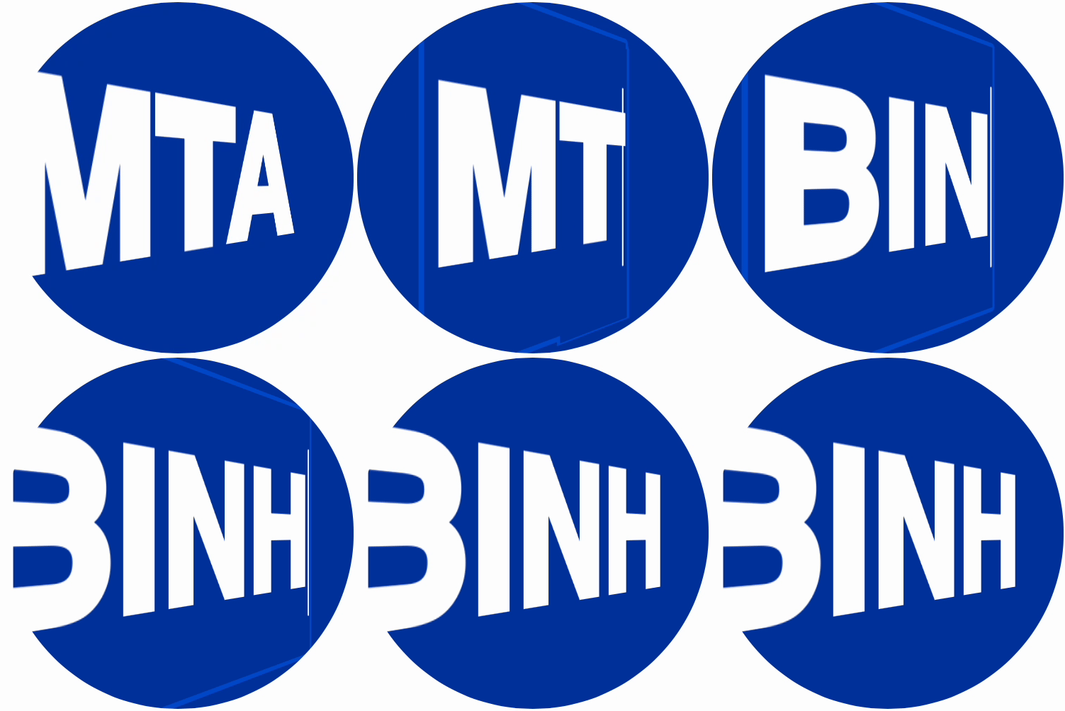
MTA Logo in HTML/CSS

It’s hard to remember how much I knew about the MTA or the MTA logo before moving to New York City three years ago. But now that I live here and take the subway regularly I encounter the logo on occasion and have mentally placed it in the pantheon of my favorite logos. The logo is simple yet presents its wordmark boldly. The skewed letters, which importantly all have flat tops and bottoms that sit and take up space at the cap height and baseline, conjures the shape of subway car at a familiar angle. I find it so well considered and designed and understand why they’ve kept this logo since 1994.
Because of the logo’s simplicity I thought it would be a fairly simple coding exercise to recreate in HTML/CSS and a good way to brush-up on some CSS transforms. I spent maybe an hour or so messing around and this was the result:
The exercise was pretty straightforward for someone like me with a good amount of experience with CSS transforms. I did assume this would involve using skew but actually only really needed rotateY and perspective. I think it’s a pretty faithful adaptation of the logo — so faithful that it’s hard to tell it’s not just an image. Because of that I added the contenteditable attribute so you can interact with the HTML if you want.

Below is an animation showing all the transforms added consecutively to easily illustrate the process. First perspective(200px) is added which will affect the appearance of other transforms. Then rotateY(32deg) is added to create the main, distorted text effect. Finally as a way to manipulate the text to more faithfully match the logo wordmark and to slightly move the text into position I added scaleY(1.25) and translateX(12px) respectively. In this animation, you’ll notice the font looks off as this is before applying -webkit-text-stroke-color and -webkit-text-stroke-width. Also this should be fairly obvious but to create the effect of the text masked by the circle, overflow: hidden is added on the parent element.
Just for fun I whipped up a quick animation to complete the thought conveyed by the logo: a subway car leaving the station and pulling up to the station.
All in all this was a satisfying exercise and also simple enough that I was hopefully able to technically explain it somewhat competently. Whatever your version of the MTA is for you, I recommend you support public transportation if you’re fortunate enough to have it! And if you’d like to explore the code I created Codepen here.
